Handsome Cycles
Role
UX Design
UI Design
Art Direction
What was the problem?
Handsome Cycles is a no-bullshit, quality-made bike company based in Minneapolis, MN. In 2016, they were ready to expand their retail experience to a DTC offering nationwide. There was only one problem: how do you communicate the exhilarating thrill of riding a well-built bike through a digital-only experience?
What did I do?
I worked with the great team at KNOCK to develop a story about the quality of a Handsome Cycle. What components were they using in their bikes? What kind of steel do they use? Why does it matter? The website serves as a portal to convert everyday people into riders by helping them understand not only bicycles but the culture of biking. I sought to remove the stigma that biking is just for elitists. To do that, we had to communicate what makes a Handsome Cycle tremendous, but also go a layer deeper and provide simple maintenance tutorials and culture guides to deepen their understanding of bike ownership.
Outcome
52%
increase in organic traffic to website
14%
Increase in sales of new bikes online
23%
Increase in parts & accessories sales through Amazon Integration
32%
Increase in add to cart rate across categories
12%
Increase in newsletter signups
100%
Success rate in transfering accounts from old site
UX Design
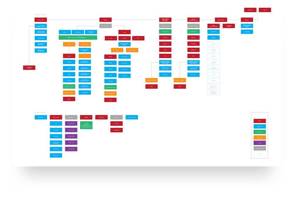
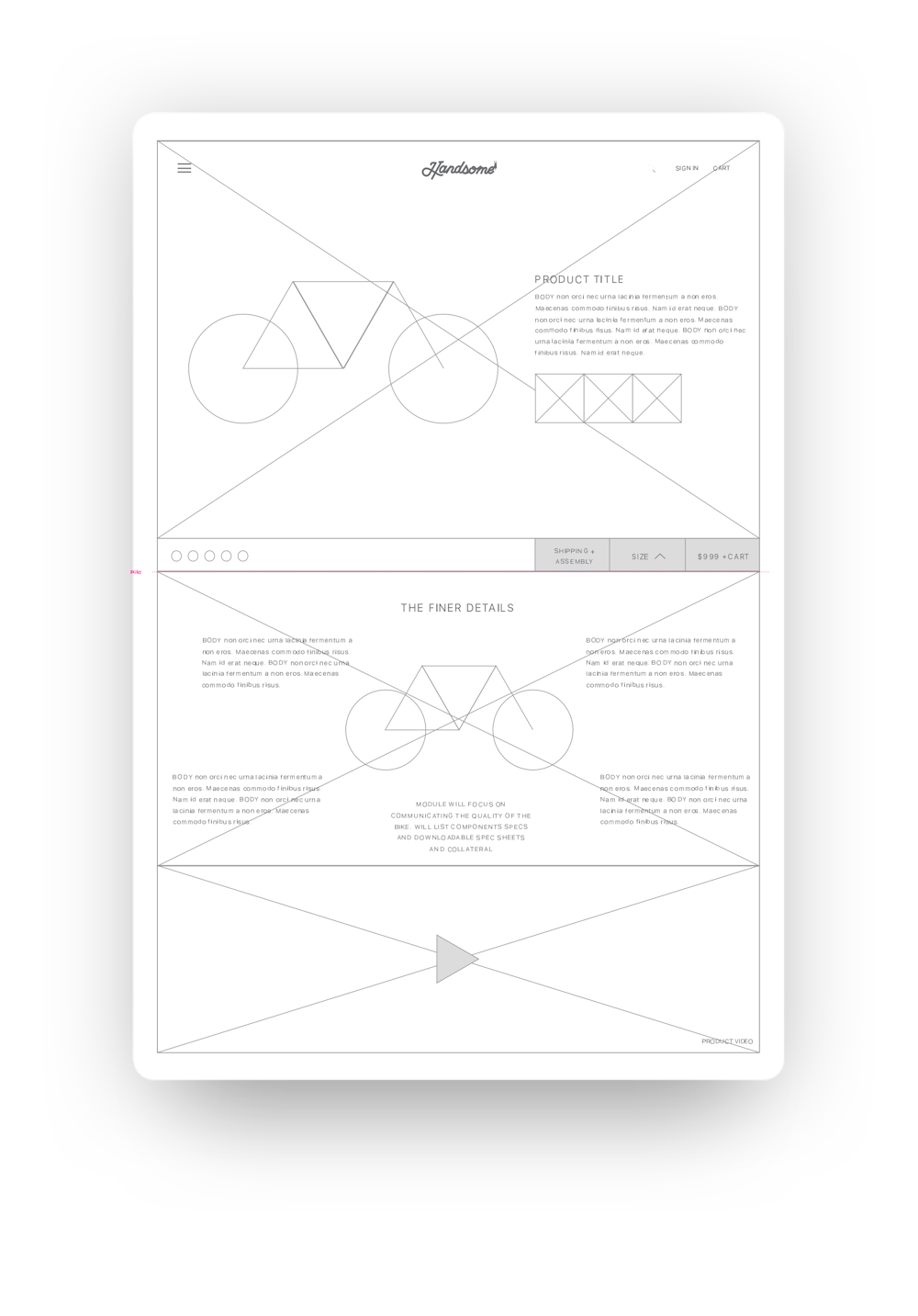
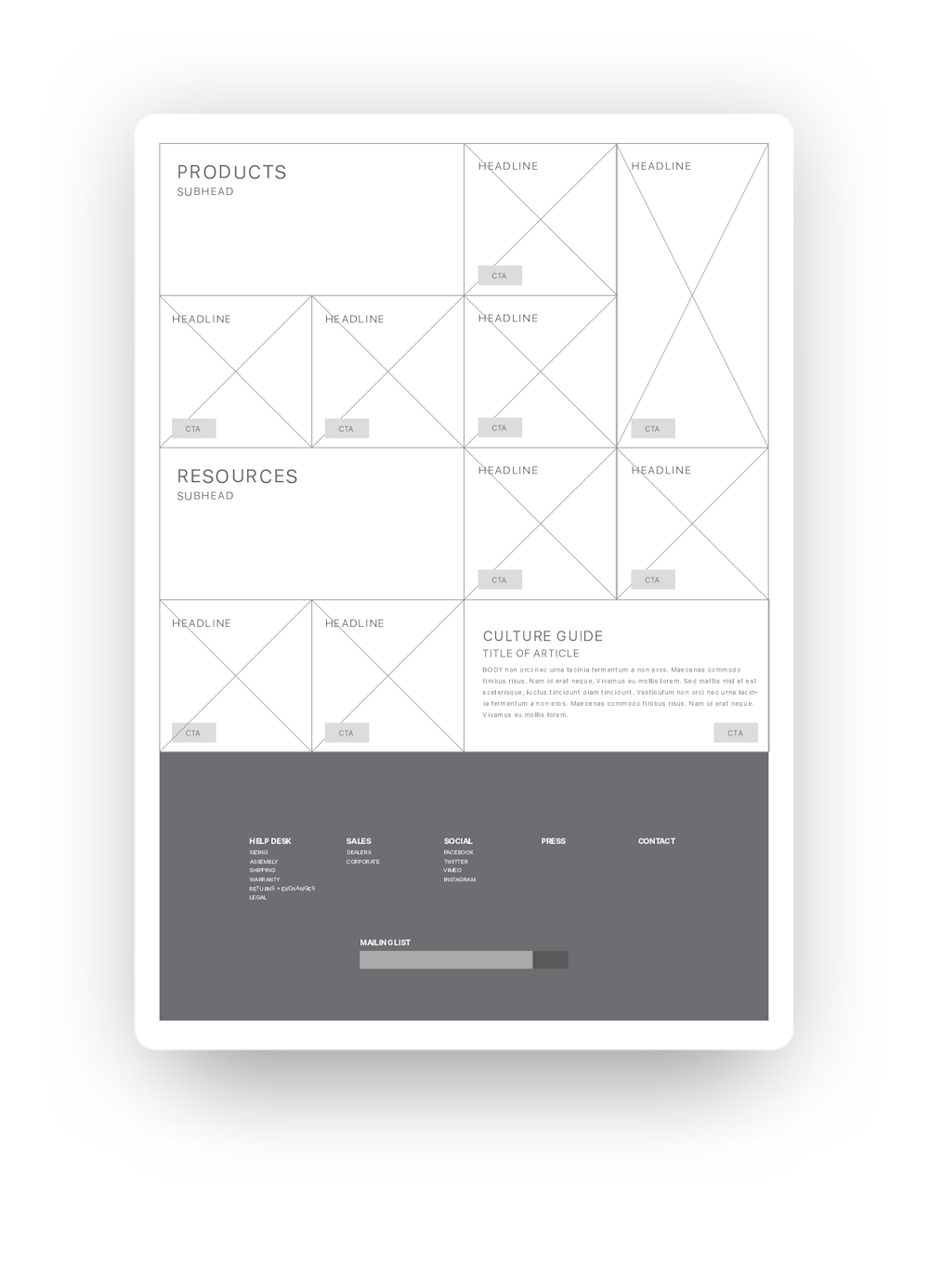
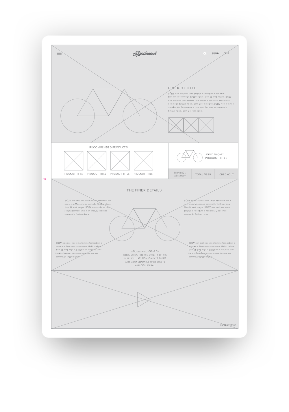
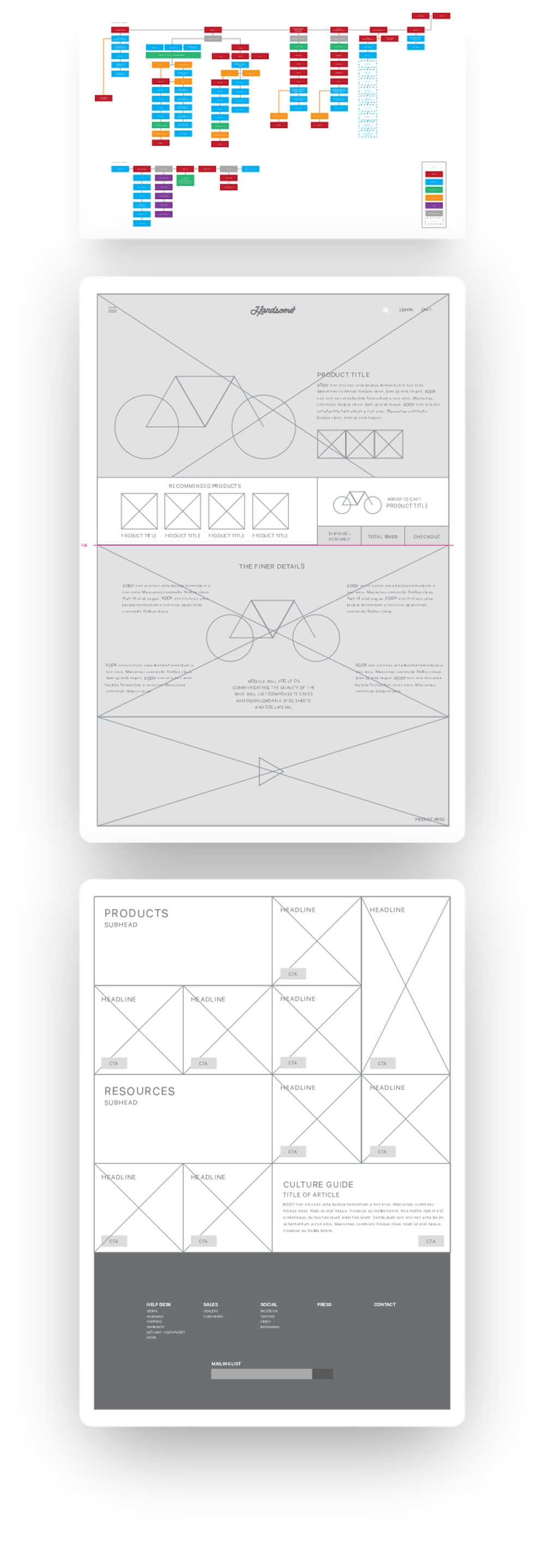
When building the Handsome site, we had to take into account parts, accessories, synced inventories across multiple platforms, resources with tutorials and videos, and much much more. The UX process was focused on how to arrange content so that it not only offered value to prospective customers, but also supported our #1 goal: to sell bikes.
Design System+
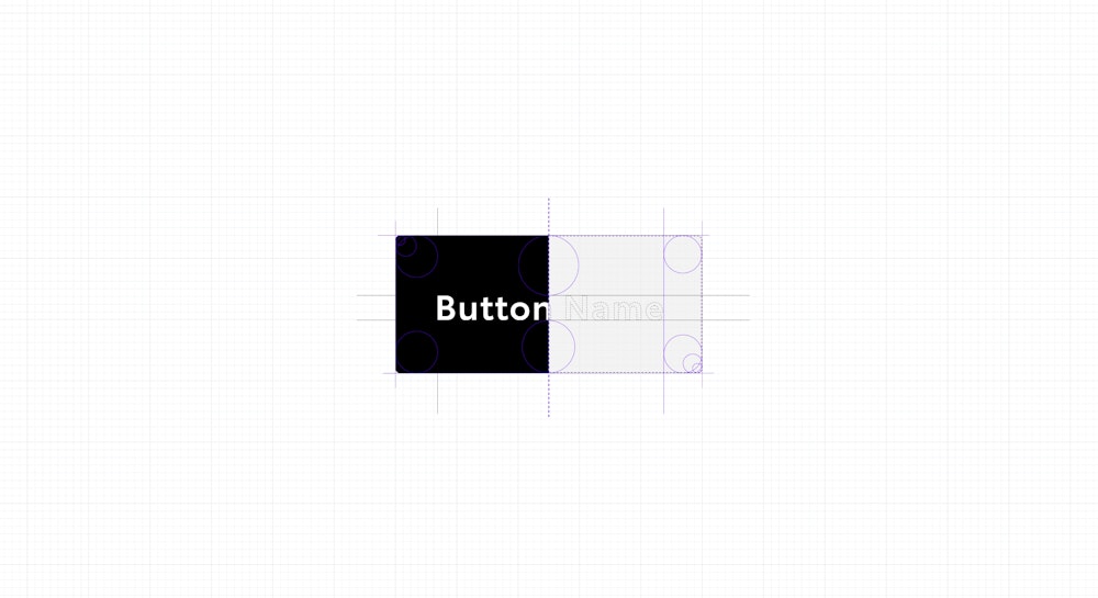
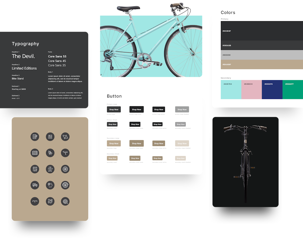
The initial brandmark was designed by Jason Miller. His stuff is great, look him up. I expanded the work into a full design system including: buttons, forms, controls, typography, and colors.
I also concepted and art directed the product photoshoot. Highlights below.


UI Design
Handsome’s mission is bikes for everyone; the website had to reflect this. Through clean layouts featuring huge, impactful photography of the bikes and bold swashes of color throughout, the site demystified the bike buying process in an exciting, memorable way.


